I’ve read countless reviews of iOS 8 and the new iPhone 6’s, but most, if not all are targeting generic end users. So I’d like to take a look at these new iOS offerings from Web Designer’s perspective.
If you’d like a more technical breakdown of the changes in iOS 8 and the new phones, check out Breaking the Mobile Web. It’s a great read!
Useful extensions and apps
With iOS 8, Apple (finally) added the ability for iOS developers to create app extensions, notification widgets, third party keyboards as well as open up a plethora of other API’s. I thought I’d highlight some of the ones I’ve seen that can make our jobs as web designers a little easier.
Awesome Screenshot for Safari (App Store)
![Awesome Screenshots [screenshot]](http://ryantvenge.hbserver.dev/wp-content/uploads/2014/09/awesome-screenshots-1.png)
![Awesome Screenshots [screenshot]](http://ryantvenge.hbserver.dev/wp-content/uploads/2014/09/awesome-screenshots-4.png)
![Awesome Screenshots [screenshot]](http://ryantvenge.hbserver.dev/wp-content/uploads/2014/09/awesome-screenshots-3.png)
Awesome Screenshot for Safari is a great way to take, crop and annotate screenshots in Safari on iOS. The interface can be clunky when adding text, but overall much better than a vanilla screenshot that says nothing.
Remote Inspector
This is nothing new in iOS 8. It’s actually been in since iOS 6. We all love our web inspectors because it’s so easy to debug front-end code. You can do this (with a Mac running Safari) as long as you are on the same network or are connected to the computer via USB. See this tutorial for more info on how to use it.
View Source (App Store)
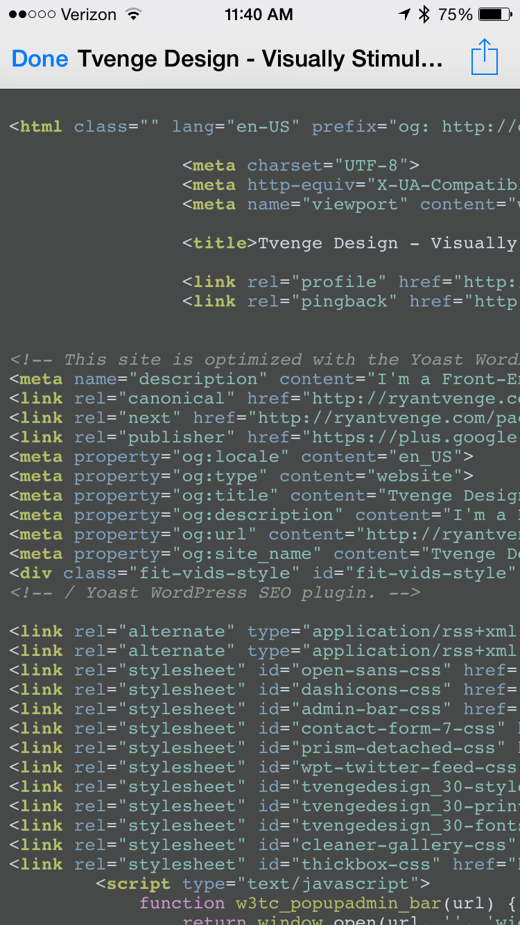
View Source is an extension for viewing source html of a web page right in Safari (this should really be native in iOS). If you aren’t at your computer with a remote inspector, this a nice way to see the html of a page.
I would really like to see some improving on this extension, including inertia horizontal scrolling, code beautification and linking of external files (such as css and js). But, for now, it’s a great start.
Transmit (App Store)
Just like Diet Coda, this is an “in case of emergency” app. I’m still on the fence about buying this because I’m not an FTP Commando anymore, right? I’m sure I’ll kick myself when, one day, I have to quickly upload a file to a server on the go.
I would encourage you to read the review on MacStories for more detail on the app.
Prompt/Prompt 2 (App Store)
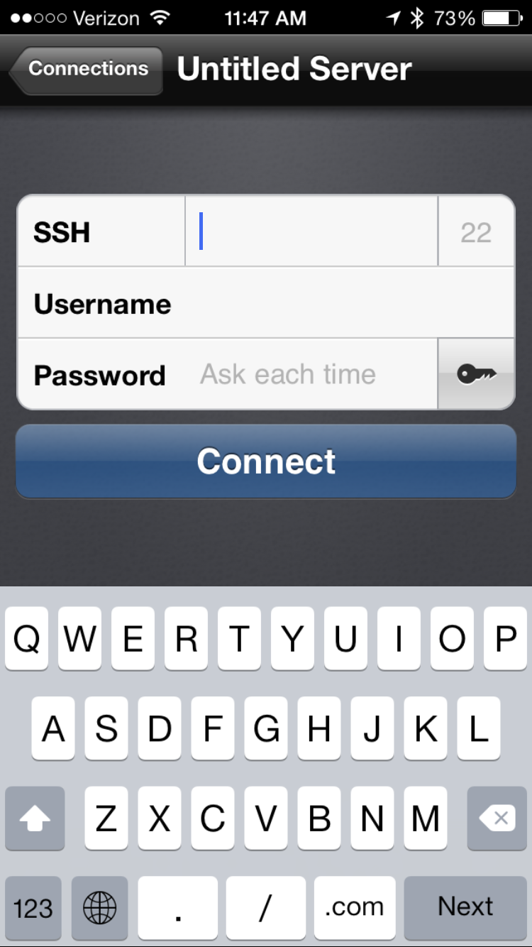
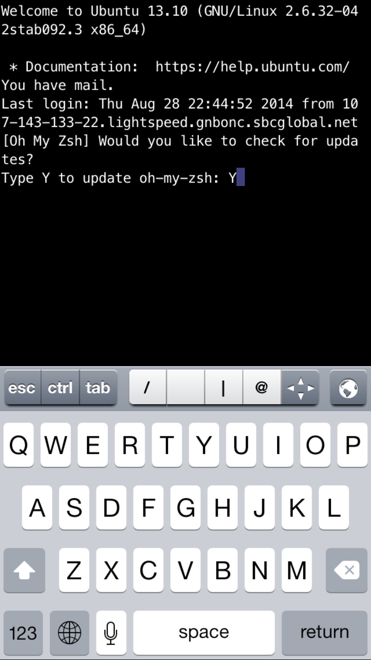
This is a must have app for us, as we are continually SSHing into servers. Again, you aren’t regularly logging in to servers on a phone, but when that server goes down while you are laying on Fort Myers Beach, it’s nice to know you have the control to sudo service nginx restart.
If you don’t own Prompt yet, Prompt 2 should be out any day, so wait for the new and improved version.
Password Vaults and Safari
With the advent of Safari extensions (These should have been there a long time ago), you can now have an app autofill forms in the DOM. Security expert Steve Gibson has recommended LastPass for years, believing it is the most secure option out there. That being said, I’m using 1password because I’m invested in that system, and I feel that my passwords are very secure.
1password and LastPass have seemingly reached feature parody, so I feel you will be happy with whatever choice you make. They both have my favorite feature, shared vaults (LastPass 1password), meaning you can share server creds, WordPress logins, etc with your development team (huge!).
To learn more about password managers, the internet can explain it better than I probably can.
Viewports and pixel densities
The biggest thing that affects us web designers is the bigger phones, which have been around on all other smartphones for some time. Ideally, you’re responsive website should look great at every pixel from 320px to 1200+px, but it’s important to pay a little more attention to these new breakpoints. Here are the viewports for all of the supported iPhones:
| Portrait | Landscape | Pixel Density | |
|---|---|---|---|
| iPhone 4/4S | 320px | 480px | 2x |
| iPhone 5/5S | 320px | 568px | 2x |
| iPhone 6 | 375px | 667px | 2x |
| iPhone 6+ | 414px | 736px | 3x |
As the size of these screens get bigger, it’s much more tolerable for the user to use the phone in landscape mode, so keep an eye on those landscape breakpoints.
If you are using responsive images, you’ll want to create 3x assets to utilize the higher-res screen on the iPhone 6 Plus. The 6 Plus has a 3x pixel density, compared to the 2x pixel density of all the other devices. I haven’t ventured into responsive images yet, as I try to use SVG’s whenever I can on vector graphics.
A small win for the web
One complaint I’m seeing from users (myself included) is that most apps are not “optimized” for the iPhone 6/6+ screens yet. All sites that are using responsive web design worked day one. Let’s not celebrate too much because if native didn’t exist, I wouldn’t be talking about all these cool tools you can use on your phone that make your job easier.
iPhone 6 or 6 Plus?
For those of you who are in the market for a new iPhone, I thought I’d share some of my thoughts when making my purchase decision:
Option 1: Don’t upgrade
If you have a 5S, upgrade is a hard sell, because the price can be hefty.Having iOS 8 and TouchID is enough to make your 5S feel that much better. If you have anything older than a 5S, I think it’s worth upgrading (If you are doing 2 year contracts, you are basically throwing away a year of phone subsidies).
Option 2: iPhone 6
IMHO, it’s the perfect size and this is the phone I went with. As a Web Designer, I’m using tools like Sublime Text, Terminal and Photoshop, so I still can’t do “real work” on my phone (or iPad for that matter), so there wasn’t a compelling reason for me to get the 6 Plus.
Option 3: iPhone 6 Plus
It’s much bigger and you don’t know until you actually hold one. I would visit a store that has both and hold them in your hand. My wife opted for the Plus, and she does like it. If you are trying to justify the purchase, the iPhone 6 Plus has 3x pixel density compared to the normal 2x of the iPhone 6, so you can be testing <picture> elements or srcset on it.
In the end, the phone you pick is a personal decision and there are no blanket answers. Go to an Apple Store and hold them in your hand and see what you think.
Exciting times
This is a really exciting time to be on the web. There is competition in the mobile hardware and OS markets, and we are seeing some really cool things!
But one thing I have learned over the years; don’t get too sucked into the “tech” and rumor-mills. We all want to know what the next big thing Apple or Google is making, but don’t let it consume you. At the end of the day, we make cool stuff on the web and have the power to change the way people interact in the world. The hardware and OS’s are important, but the web is hardware agnostic. Don’t loose site of the open web and it’s core fundamentals.